
Through the Looking Glass
A Designer’s Take on Apple’s “Liquid Glass” UI
Apple has always been the type of brand that doesn’t just ride design trends—it sets them.
With the recent introduction of its new “Liquid Glass” interface, it’s doing what Apple does best: stirring conversation, inspiring curiosity, and sparking equal parts excitement and skepticism across the design world.
As a senior designer at Truscott Rossman and Say More (a content studio powered by Truscott Rossman), I may not be involved in UI design on a day-to-day basis, but I absolutely care about how UI shapes the overall brand experience and its attention to inclusivity. I keep a close eye on how major brands use visual design choices, like Apple’s, to express identity, signal evolution, and influence the creative landscape. So naturally, the introduction of Apple’s Liquid Glass UI sparked my curiosity.
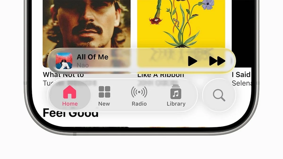
Minimalism with Movement
My first impression? Honestly, I don’t really mind it.
It didn’t ‘wow’ me to the same degree as some of Apple’s previous updates and releases have, but there’s something satisfying about its minimalism and sense of fluidity. I’ve always subconsciously gravitated towards minimal designs that reduce visual clutter, and this direction feels like it scratches that itch (to a degree).
A large perk, in my opinion, is the increased screen real estate. Apple’s design minimizes visual weight in the navigation, allowing more of the screen to shine through. As someone who likes to see as much content and as little chrome as possible, that’s a welcome shift. And while the aesthetic might not appeal to everyone, the fact that it comes with customization options, particularly around motion, contrast, and transparency, makes it feel more intentional and thoughtful.
The Accessibility Question
Of course, you can’t talk about a visual overhaul like this without addressing accessibility.
And that’s where things get complicated.
I’ve seen the debates happening on almost every social platform online, especially on forums like Reddit, about whether Liquid Glass sacrifices usability for style. It’s a fair concern that I do agree with and stand behind. In any form of design, accessibility should never be treated as a secondary consideration or something to “tweak later.” It should be foundational.
That said, I was glad to learn that Apple seems to be building in a range of customization tools to let users adjust transparency, motion, and contrast based on their needs. If these settings are intuitive and easy to manage, it could offer a flexible user experience that doesn’t leave anyone behind. But Apple will need to clearly communicate those capabilities—and follow through with ongoing accessibility refinements—to earn the community’s full confidence.

Creative Impact? Not Quite Yet
From where I sit in the graphic design world, I don’t think this particular shift is going to cause major creative ripples, at least not right away.
The work our graphic design team is fed on a daily basis is largely static, not interactive, and we’re not designing digital interfaces or mobile platforms. So the design principles of Liquid Glass (in a motion graphic sense) don’t immediately cross over into my day-to-day. It feels like a style that’s very specific to Apple’s own identity—sleek, modern, and a bit futuristic.
That said, even though this stylization doesn’t feel entirely ‘new’, I still wouldn’t be surprised if aspects of this aesthetic start influencing more motion graphics or immersive content down the line.
Apple has a history of initiating design language shifts that ripple outward over time, whether it was initially met with negative feedback or not. It may not happen overnight, but I’ll be keeping an eye on how other designers reinterpret the feel of “depth meets transparency” in their own media.
A Brand Saying More with Less
To me, the bigger story behind Liquid Glass is how Apple continues to communicate its brand values through design. This new interface reinforces their long-standing focus on minimalism, clarity, and immersion. It’s not just about soft edges or transparent surfaces, it’s a visual reminder of Apple’s core mission to make technology feel effortless. By stripping away visual weight and pushing more content to the forefront,
Apple is saying: “Let’s get out of the way so you can experience more.”
That said, I don’t think we can ignore the accessibility concerns that have come up since the announcement. As someone who deeply values inclusive design, I absolutely understand why users are raising flags about legibility, contrast, and visual strain. Transparency and motion can enhance beauty, but they can also hinder usability if not thoughtfully implemented. Design shouldn’t just look good, it should work for everyone.
I do appreciate that Apple appears to be building in ways to adjust the interface to individual needs, like controlling contrast, reducing motion, and tweaking transparency. But the success of those features will depend on how discoverable and intuitive they are to use. Ultimately, accessibility isn’t just about having options; it’s about making sure people actually know they exist and feel empowered to use them.
So while Liquid Glass may very well spark a new wave of design inspiration (as Apple often does), it will be important for creatives and companies alike to remember that beautiful design should always be inclusive design. That’s where real innovation happens.

Is your brand ready to say more with less? Contact us to start the conversation.